We worked with The Patients Union to build a brand that turns individual healthcare struggles into collective power, creating a website that helps them organize patients nationwide.
/
The Patients Union is a patient-led movement organizing people across the country to turn individual struggles with America’s greed-driven healthcare system into collective power against insurers, profiteers, and lobbyists.
We partnered with The Patients Union to build a brand and verbal identity that meets struggling patients with enough trust and solidarity to bring them into community and collective organizing.
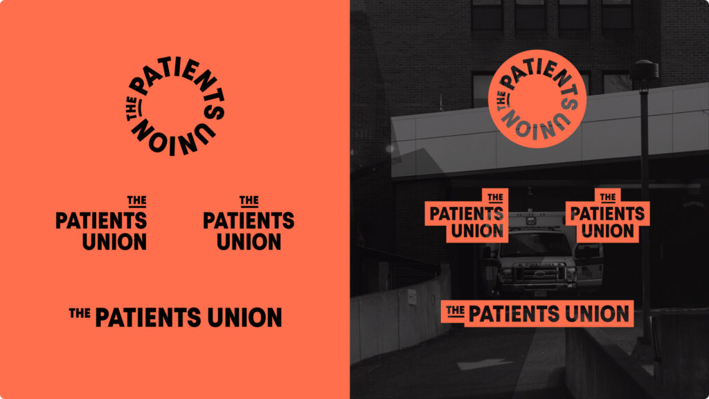
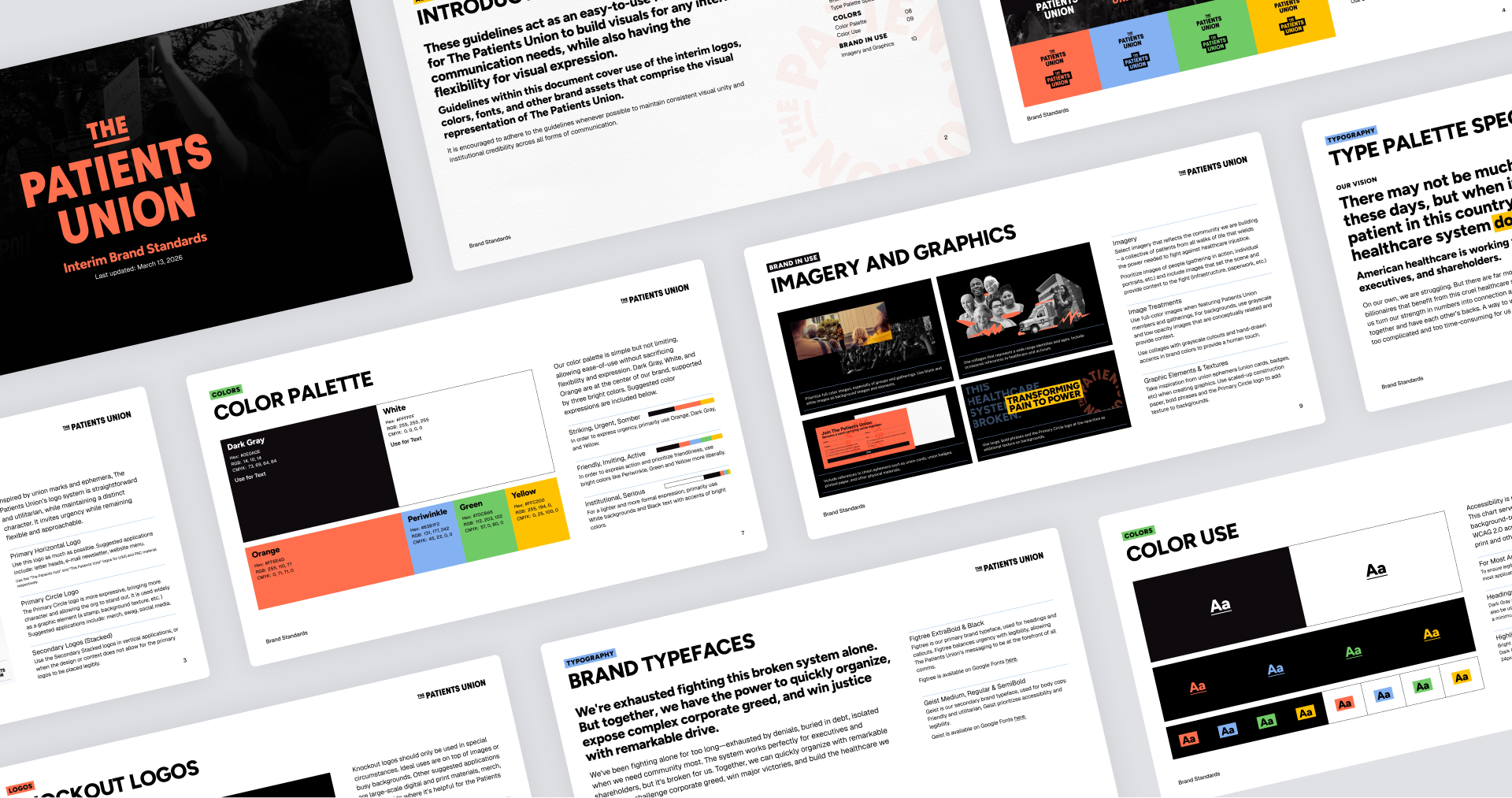
The logo and overall visual identity draw from 1950s union insignia, evoking a moment when organized labor held its greatest strength in the U.S., alongside the visual language of grassroots movement culture — collage, underlines and highlights for quick emphasis, and stamped marks that feel urgent and hand-applied.
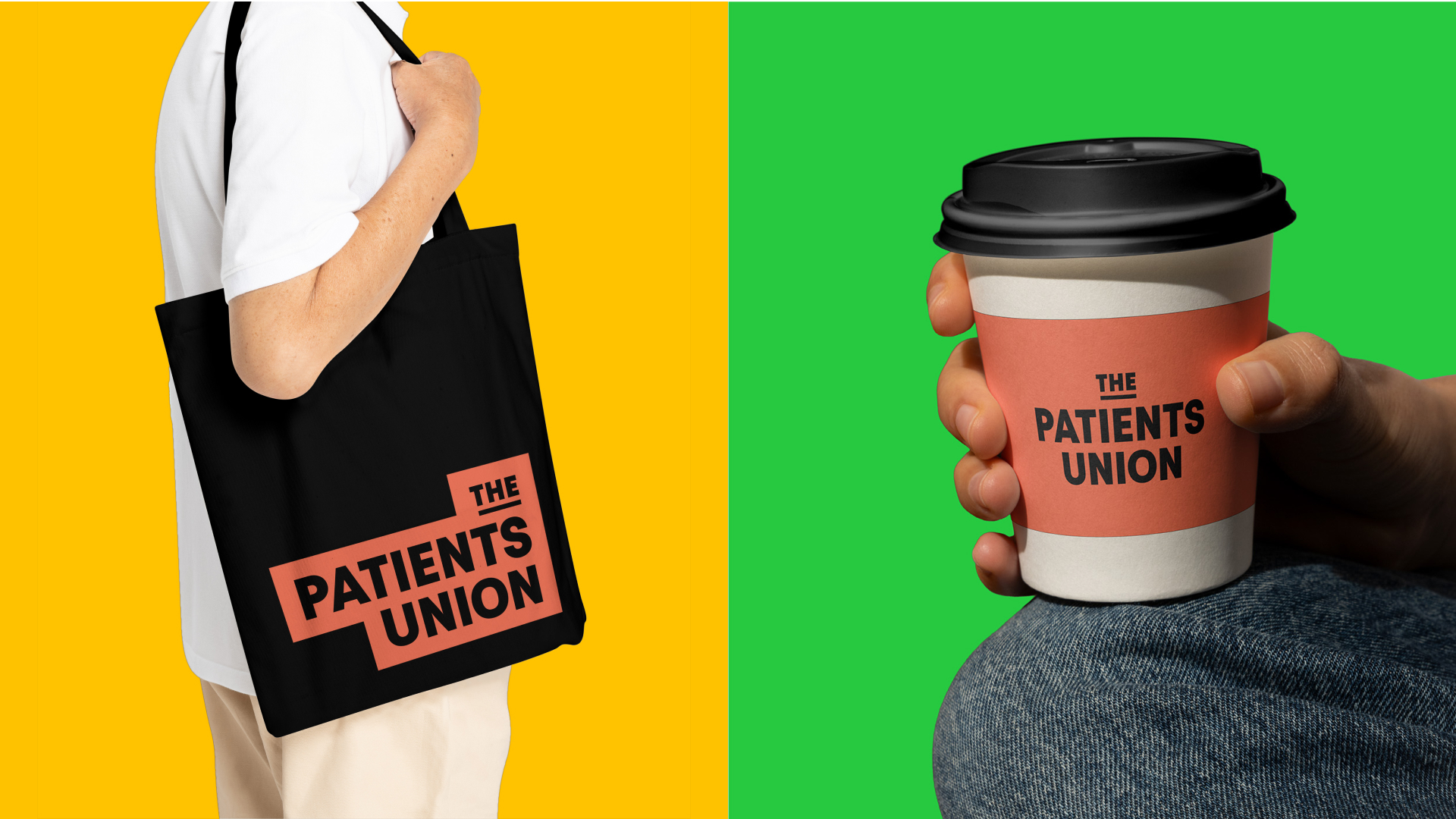
These visual motifs carried over to the website. The sign-up form was modeled after old union sign-up cards, complete with dotted lines, an embossed logo, and the weathered feel of a card meant to be carried in a pocket, passed hand to hand at a union hall.
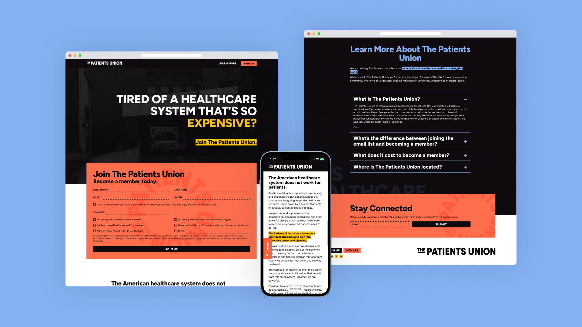
We built the visual system around a focused palette of four core colors: orange, periwinkle, green, and yellow, supported by black and white. Keeping the palette intentionally limited makes it easier for the TPU team to create rapid-response materials quickly and consistently. The restraint also reinforces the character of the brand, giving it a sense of clarity and urgency that reflects a movement built to respond, organize, and mobilize at speed.
Project Credits
Client
The Patients Union
Sector
Movement Organizing
Healthcare Justice
Year
2026
Project Scope
Brand Guide
Brand Strategy
Visual Identity
Website Design (UI/UX)
Website Development
Project Team
Maria Arenas
Phuong Anh Bui
Shivani Reddy
Malavika Srinivasan
Scott Starrett