
2018 Campaign Brand
We joined forces with AOC’s campaign to craft a brand that mirrored her powerful, impactful vision.
The Ocasio-Cortez brand heralds groundbreaking innovation in politics while honoring people’s movements of the past. In 2018, we rallied people to chant “Ocasio” alongside her. As she’s evolved into AOC, the brand continues to grow, bringing her progressive policies, plans, and visions to life.
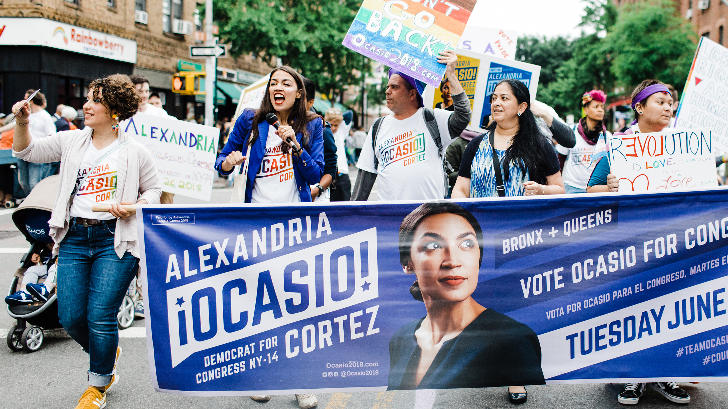
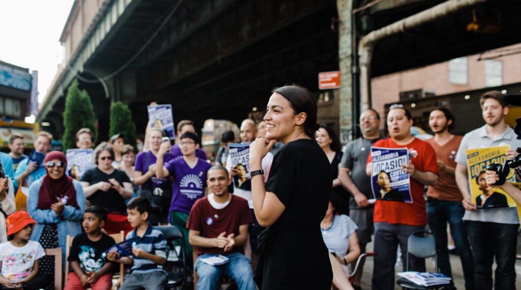
In the blink of an eye, AOC transformed from our friend in Union Square to the face of a movement, gracing magazine covers and TV screens worldwide. What began as “what if” conversations and napkin scribbles blossomed into an opportunity to change the world for the better.
A New Campaign
Facing a powerful incumbent, AOC brought a fresh, energizing presence to politics, deeply rooted in her connection to New York’s 14th district community. Alexandria Ocasio-Cortez’s congressional campaign needed a bold, optimistic design that her team could wield to achieve the seemingly impossible.

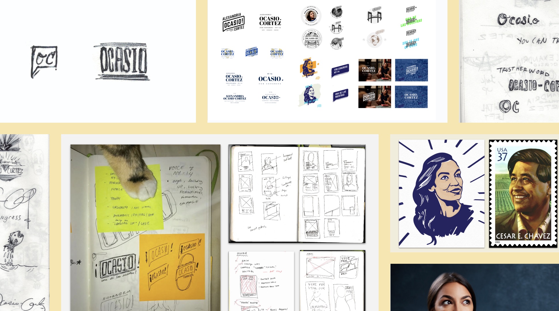
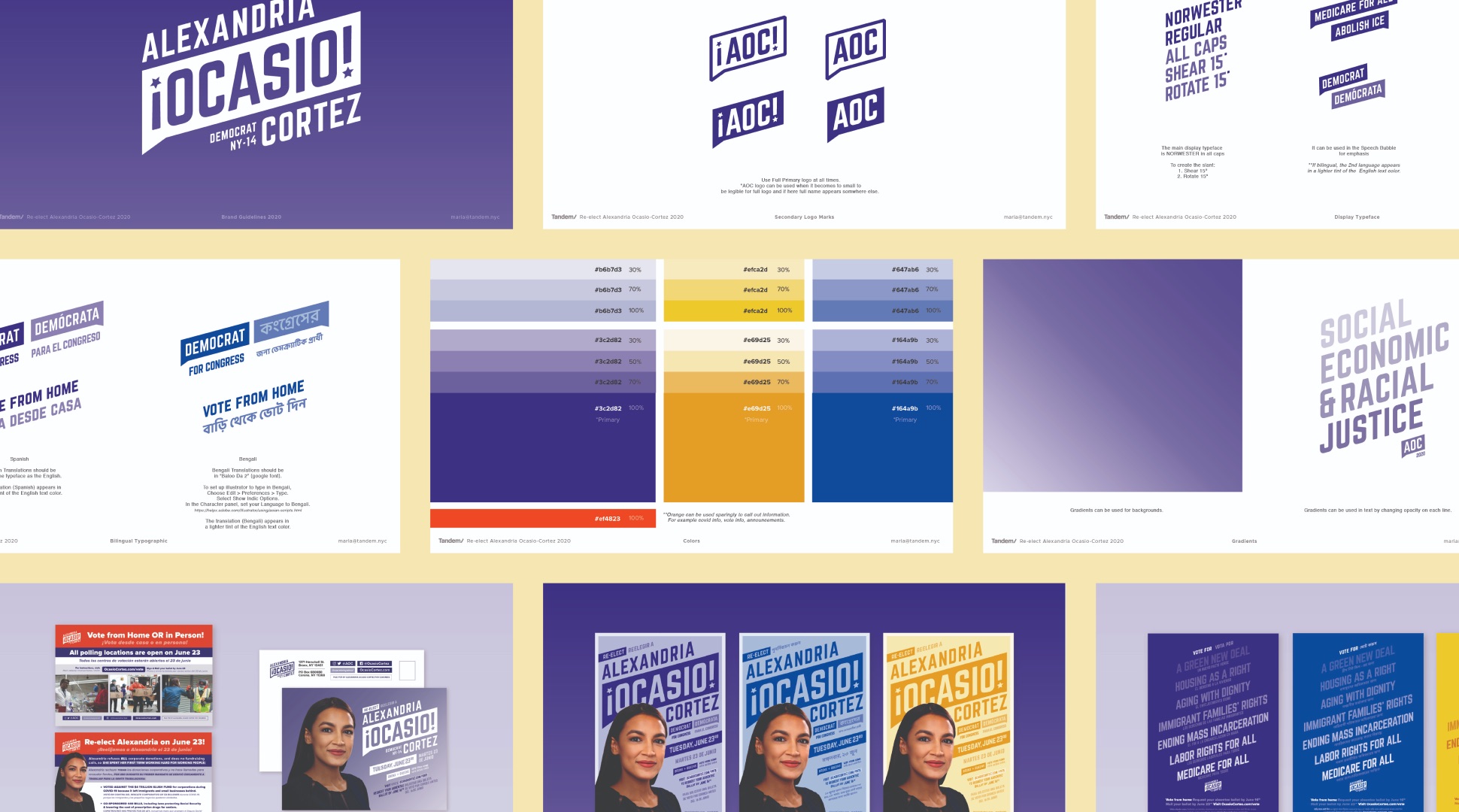
Speech Bubble
The iconic speech bubble is the cornerstone of the AOC brand, a rallying cry of the people and for the people. The upward slant of the speech bubble mark signals the progress that AOC is working towards and the energy of the movement she built.
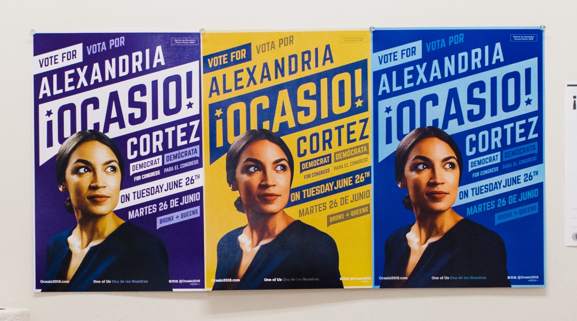
Color
The colors of the AOC brand are a fresh take on what a political color palette can and should be. The main purple of the brand was a fresh take on the standard red, white, and blue by injecting some youthfulness that represented AOC’s fight against incumbency and the status quo. The expressive color palette paired with the striking photo of the candidate by Jesse Korman created a dynamic visual language that jumpstarted the iconic AOC brand.
Languages
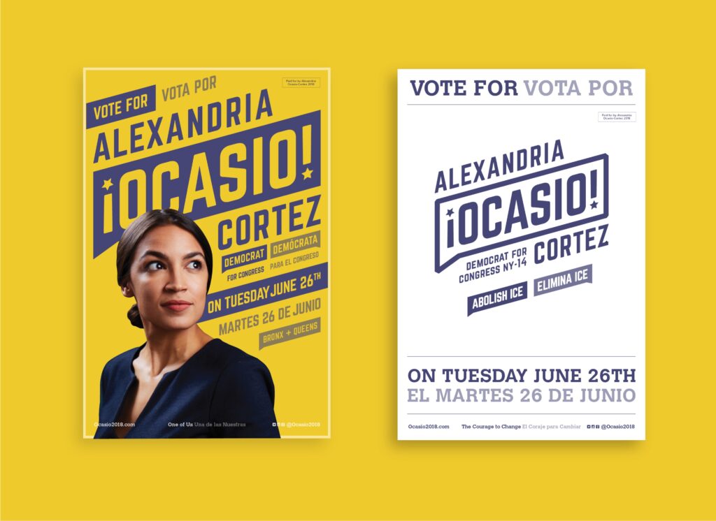
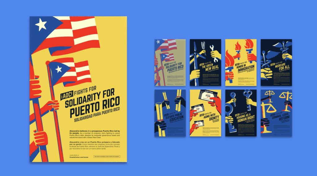
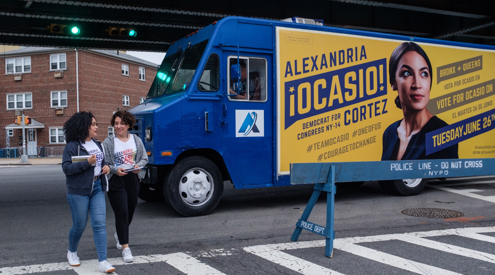
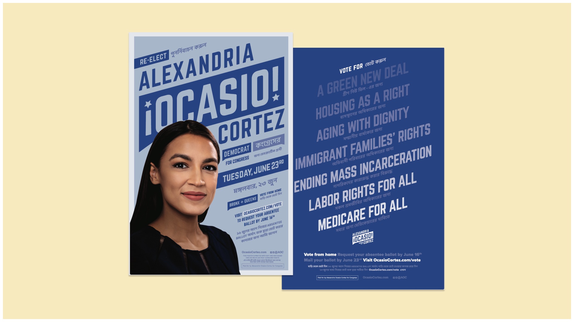
Translated versions of AOC’s materials were important to communicate to her diverse constituent base. The posters were designed to be bilingual including both English and Spanish side by side to not only allow for easier distribution but to also signal the unity between the cultures that AOC represents.
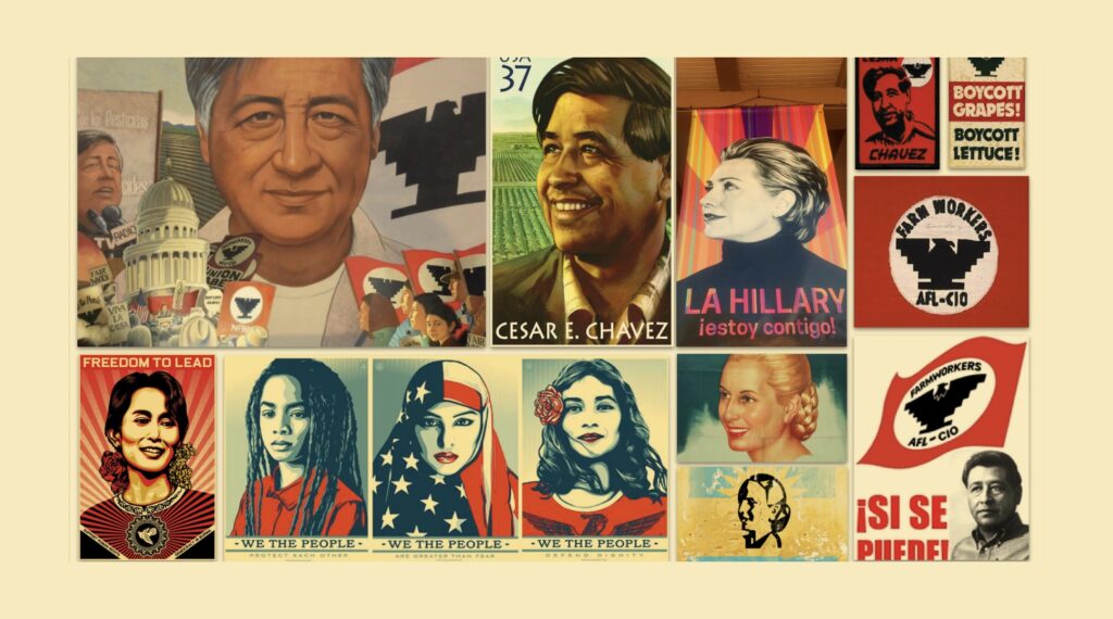
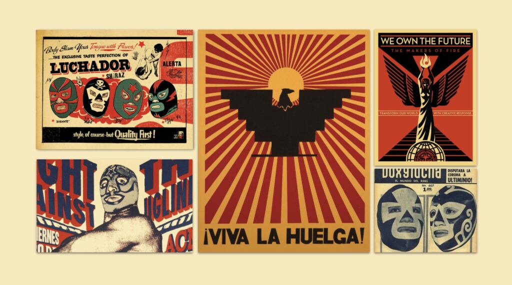
[T]he Tandem team looked to revolutionary posters and visuals from the past to inspire Ocasio-Cortez’s branding — particularly those of César Chávez and Dolores Huerta, Latino labor activists and co-founders of the United Farm Workers in the 1960s.
Diana Budds
Vox
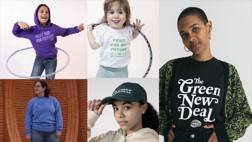
Merch Program
We collaborated with the Ocasio-Cortez team to develop a merch strategy and lifestyle brand that brought AOC’s visionary policies to life.
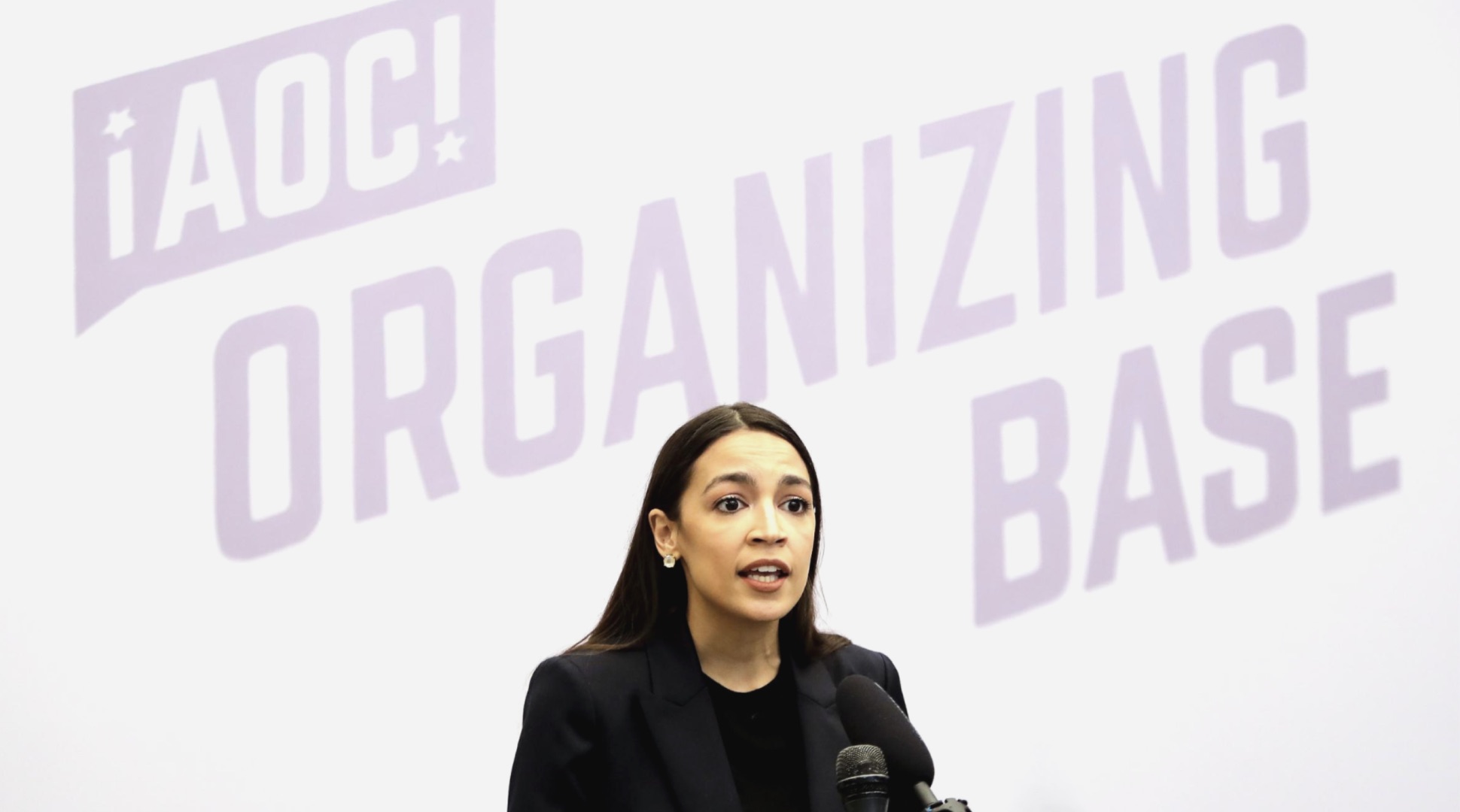
Just as she’s evolved into AOC, the brand we continue to develop captures the hearts of locals and volunteers, and appeals to a national audience across demographics. Since 2018, it has become even more vital that politics aren’t siloed so that awareness can spread, people can be activated, and change can happen. Our communities, neighbors, and friends are publicly committing to their values and need a way to demonstrate their alignment. The AOC merch program utilizes the tactics of lifestyle brands to amplify progressive messages and continue to build a unified base of supporters.
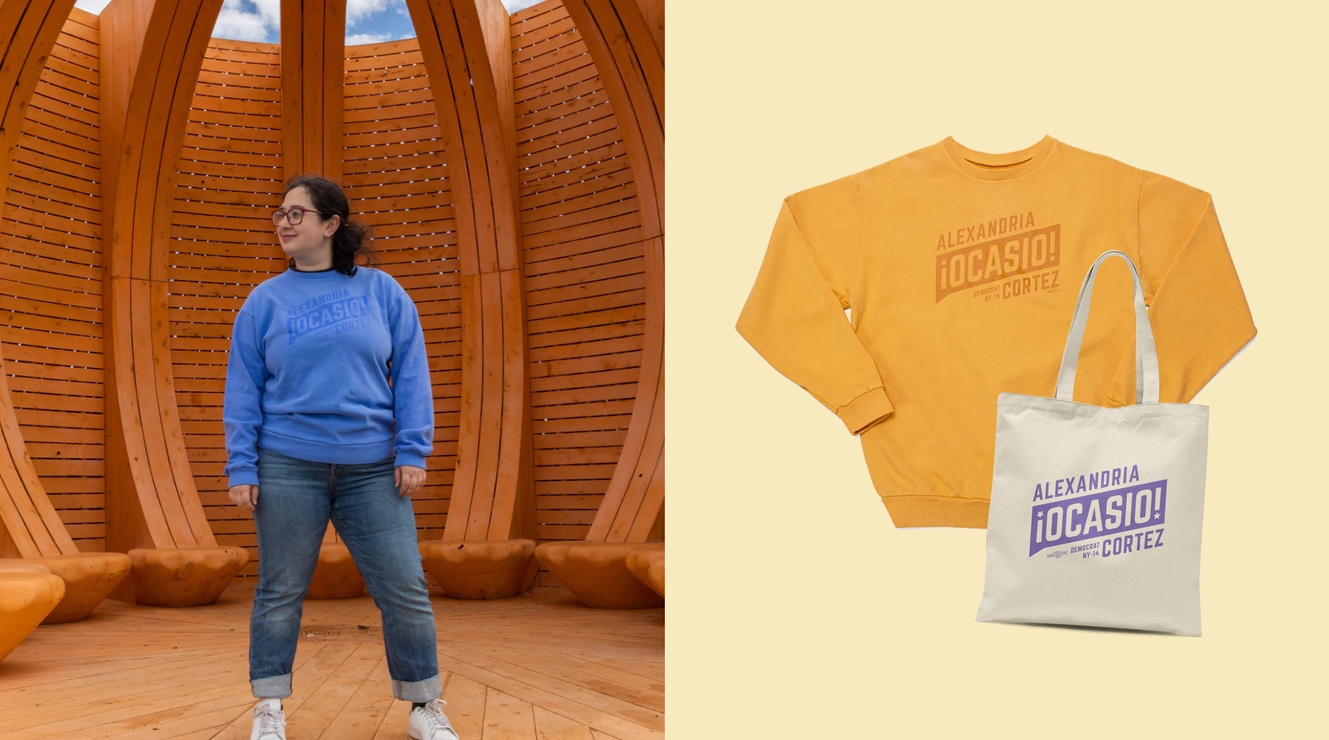
Evergreen Merch
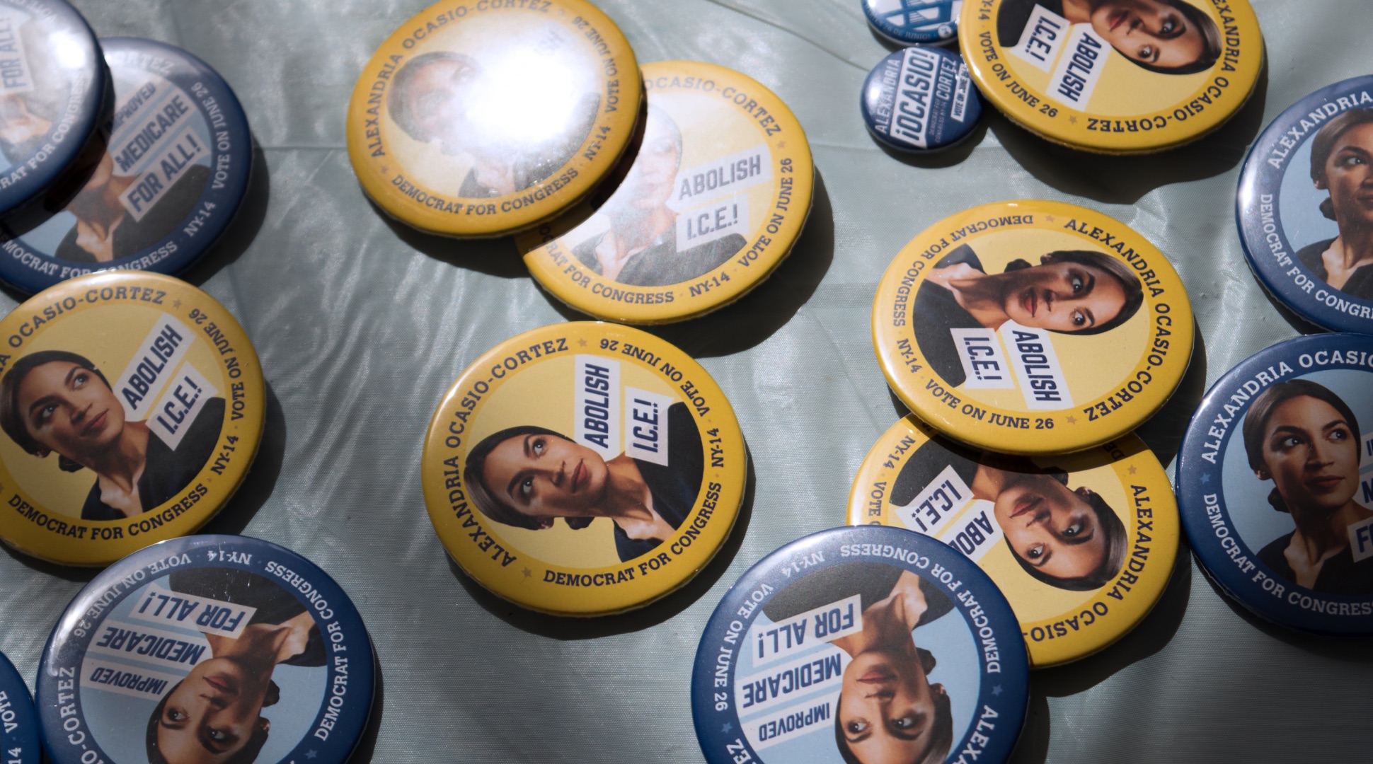
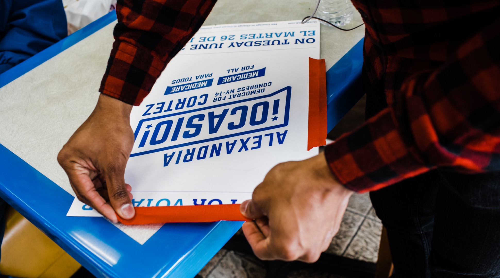
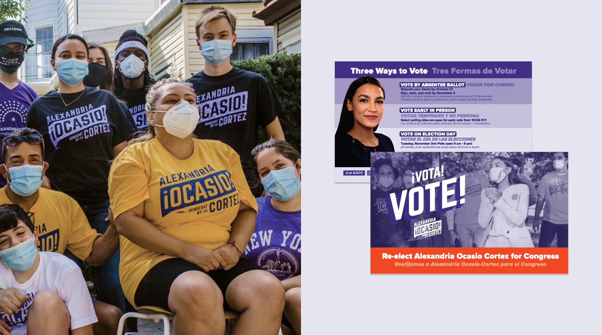
We developed a set of Union Made items for supporters to represent the AOC brand, showing their support, and creating conversations about AOC’s policies in NYC and across the country.
Quotes
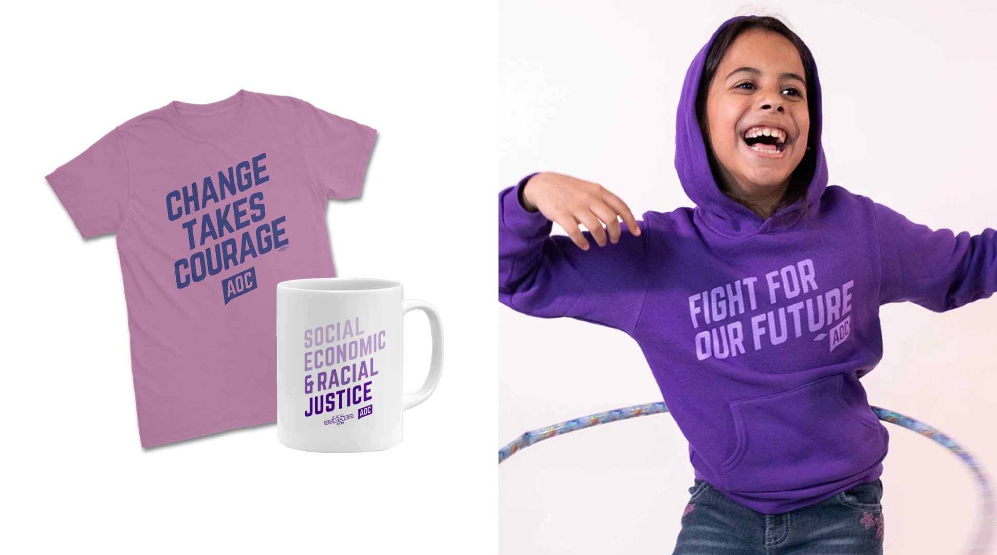
AOC’s bold policies created a set of recognizable campaign slogans and quotes that activated new supporters. This collection utilizes the brand system of the logo to boldly share these impactful rallying cries in everyday lives.
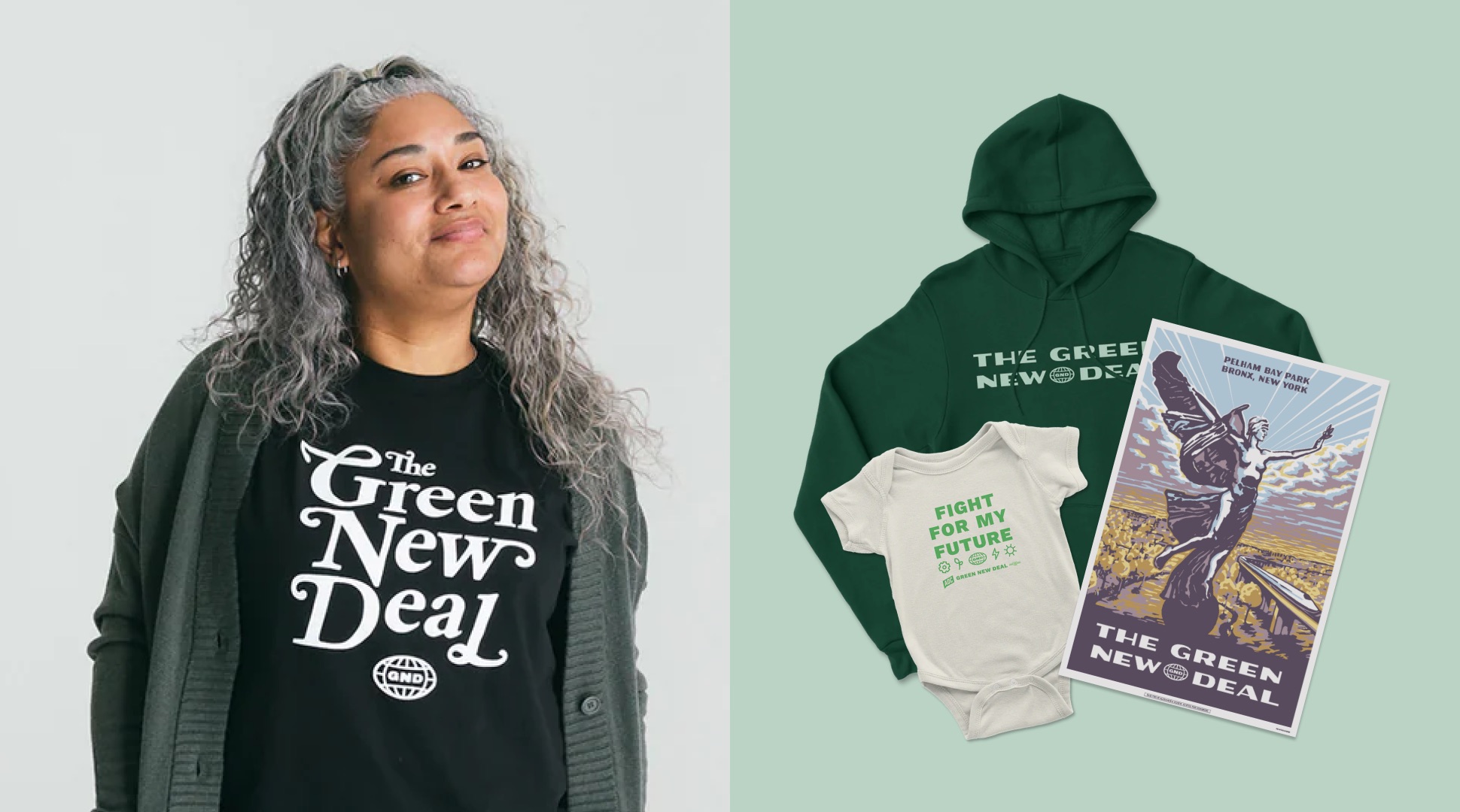
Green New Deal
AOC’s commitment to the Green New Deal went beyond supporting policy and legislation. She had a vision to make the Green New Deal a “kitchen table conversation” across the nation. We designed a set of buttons, mugs, bandanas, and posters inspired by WPA posters, National Park brand, and New york city typography to engage everyday people in this impactful and visionary legislation.
2020 Campaign Brand
As Congresswoman Ocasio-Cortez was preparing for re-election, her team asked us to build the 2020 campaign identity.
Utilizing the energy and community that AOC built in 2018, the 2020 campaign built a communication strategy around advocating for specific, achievable, and actionable progressive issues.
Updating the AOC Brand
The 2020 campaign brand expanded the color palette and developed a gradation system to allow for messaging to take center stage across materials. The brand applications center key pillars of AOC’s values, intentionally naming AOC’s platform, and integrating additional languages such as Bangla.
Eye-catching and referential graphics were part of Ocasio-Cortez’s platform from the beginning, her upstart campaign attracting attention for its radical look.
Alexandra Lange
Los Angeles Times
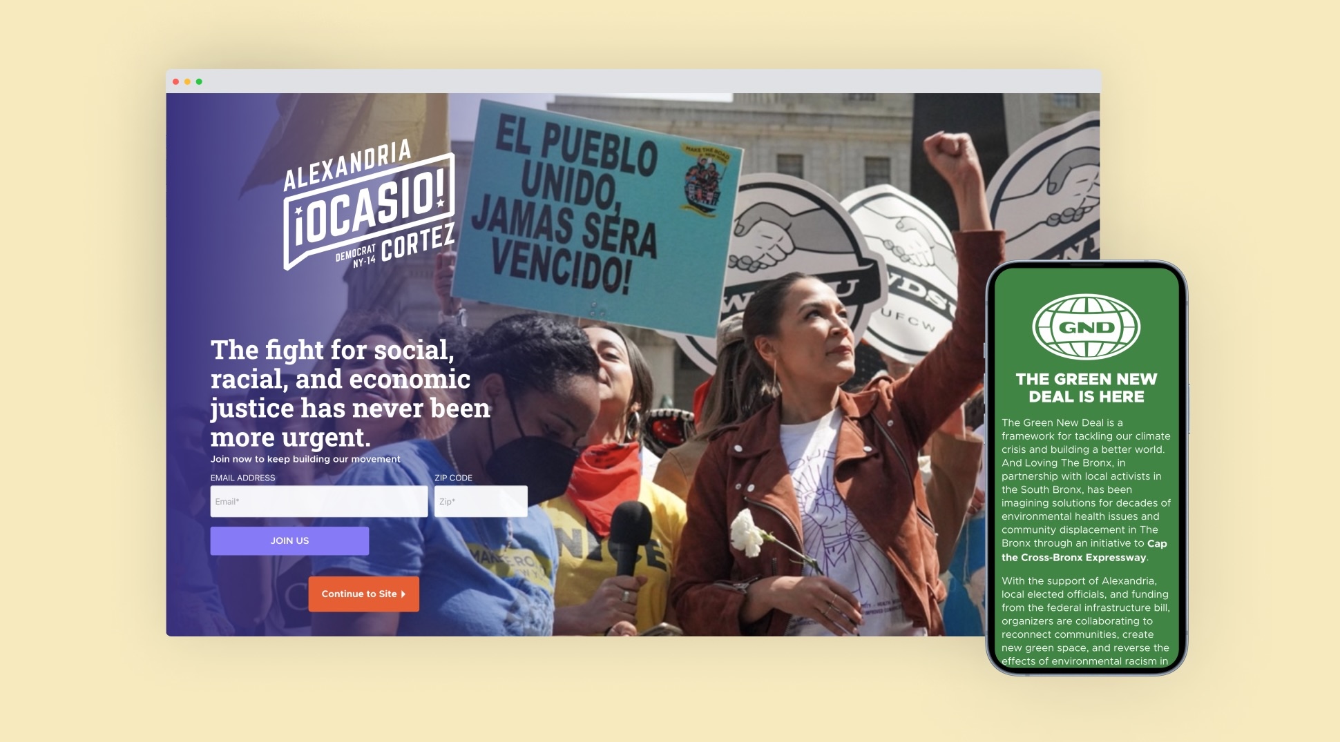
Developing the Campaign Website
We designed the AOC website to be a tool and resource for her constituents especially as in-person organizing was limited due to the Covid-19 pandemic. The Issues page was an innovative solution to a common campaign need. It was built to provide both top level points and in-depth thinking on the main issues at the center of the campaign. Specific pages for proposed legislation, such as the Green New Deal, were built to provide education, generate support, and activate constituents.
Issue-Based Projects
We built engaging visuals for the campaign’s key policies to distill complex issues into digestible topics.
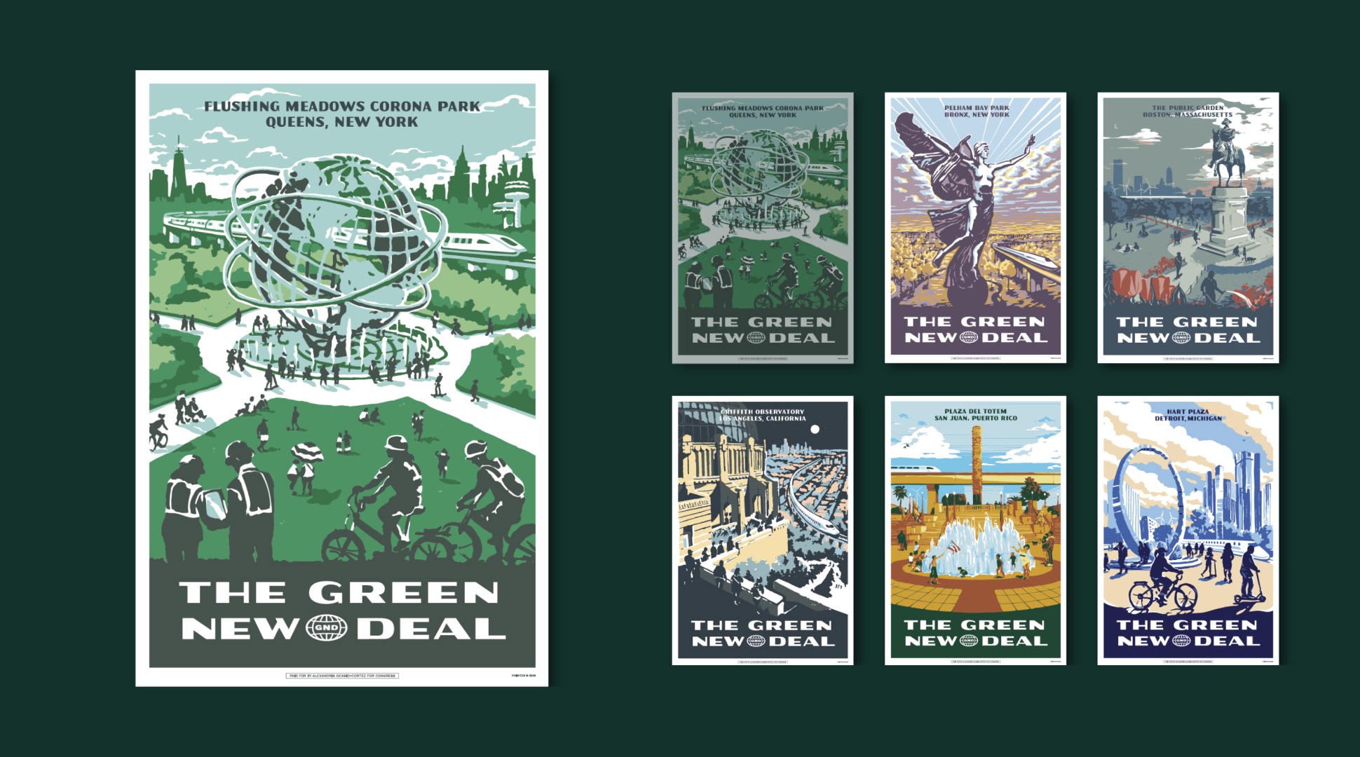
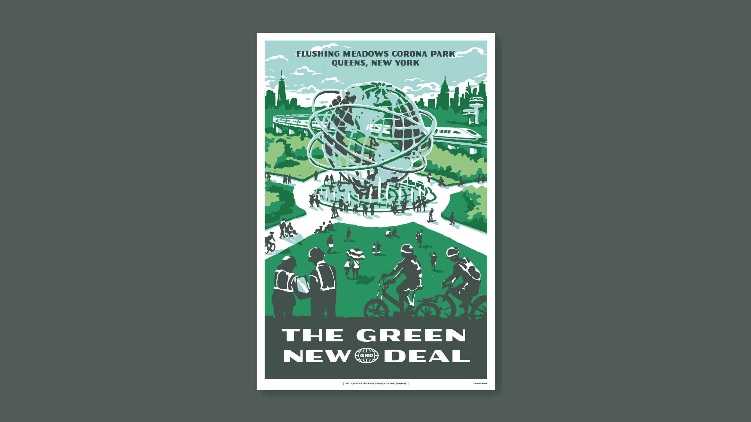
GND Posters
We collaborated with the Ocasio-Cortez Campaign to bring cohesion and awareness to the GND resolution through a brand system, merchandise collection, and a series of City Parks Posters, inspired by WPA-era National Parks Posters. By celebrating the vision of the GND, the posters inspire and connect many people with the ultimate goal of making the GND a “kitchen table topic.”
Issue Posters
After AOC’s initial campaign in 2018, she worked to uplift progressive issues and legislation to represent the needs of the constituent base in NY14. This series of posters utilizes familiar objects, representative symbols, and hand iconography to create dynamic compositions that convey the community power behind each and every one of these important issues.

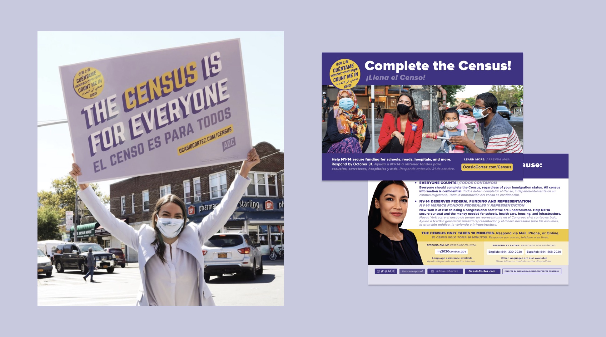
Census Brand
The Census is essential to determine state representation in Congress, community development and federal funding, and to properly account for the people that live in our communities. In 2020, the AOC campaign dedicated resources to promoting the Census amongst the constituents of NY 14. We built upon the recognizable AOC brand to create a series of multilingual materials providing education about the Census and encouraging the community to participate in this important process.
The slanted text in Alexandria Ocasio-Cortez’s logo, and its break from the traditional red, white and blue color palette, has formed a new graphical language for progressivism.
Shane Goldmacher
New York Times
Project Credits
Client
Alexandria Ocasio-Cortez
Sector
Political Candidate
Year
2018-2020
Project Scope
Handoff
Merch Design
Poster Design
Visual Identity
Website Design (UI/UX)
Project Team
Maria Arenas
Carlos Dominguez
Shaun Gillen
Shelby Rashap
Scott Starrett
Caitlin Sullivan
Collaborators
Laura Brett
Jesse Korman
Jeniffer Mason
Lazarus Nazario
Gavin Snider
Dayi Novas
Corey Torpie
Next Project